Make the

stock market

accessible

to everyone.

Website and mobile app for stock markets.
Client
role
UX & UI Designer
timeline
2022
Context
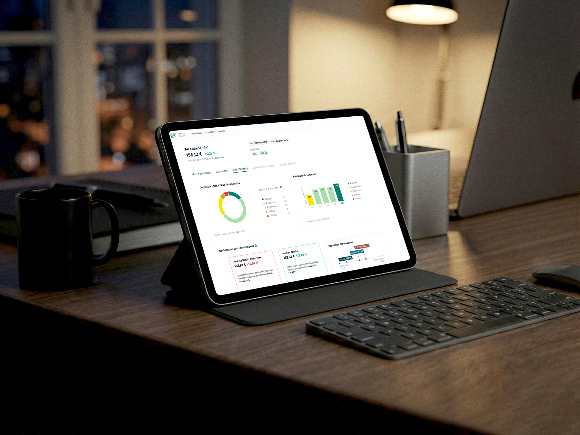
Crédit Agricole Titres wanted to change their web application according to the new design-system from Crédit Agricole.

We took that opportunity to: "Make the stock market accessible to everyone". Thanks to the methodology and the great work of the team, we did some improvements we did not think was doable.
My role

UX

I worked as UX & UI designer for several months, with the help of another designer according to the periods.

Online survey

— on 50 users

Interview

— 15 interviews about stock market

Benchmarks

— focused on the news

Data visualization

— for novice

Wireframes

— when working with a UI designer

UI

Enrich the design system
Responsive

— on a computer, tablet, or phone

White-label design

— for multiple clients

Figma
Maze
Long-term vision
The
goal
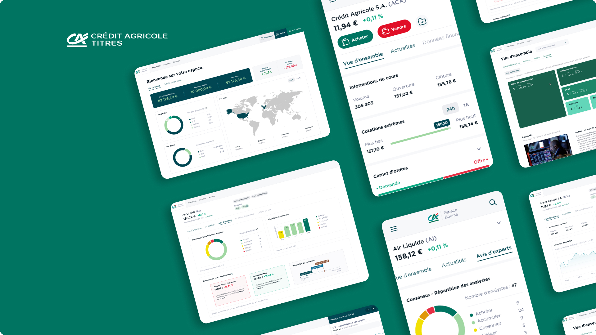
Go beyond a visual refresh to deliver a more intuitive experience and supports future white-label deployments.
01
Explore

Who are the users?

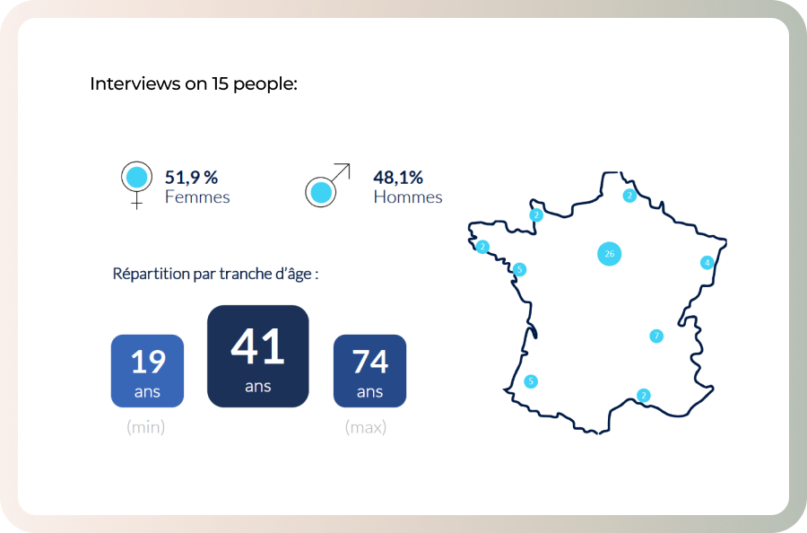
The project started with a survey on 50 users, and 15 interviews about stock market.

Interview & survey

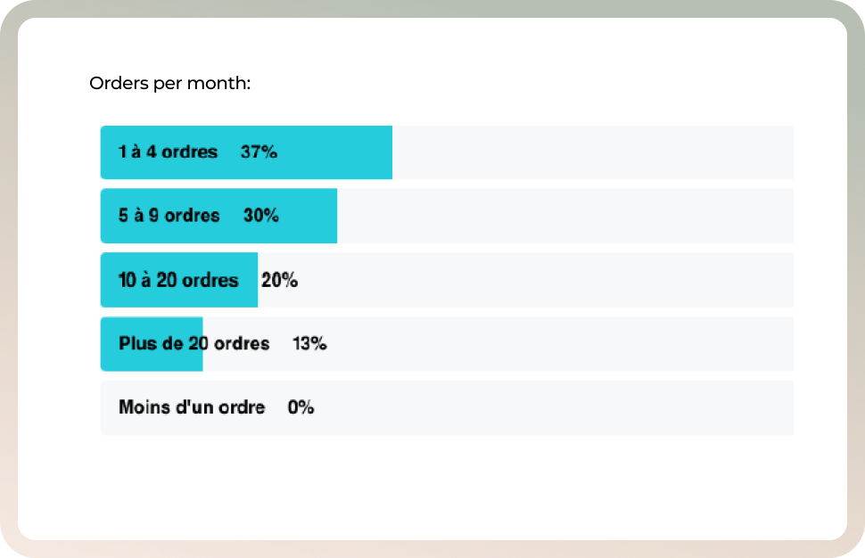
Thanks to the user research, we learnt that experts represent 20% of the users, but can place a lot of orders in different accounts. On the opposite, novices represent 80% but 60% of them have only one account with one or two products.

About their habits

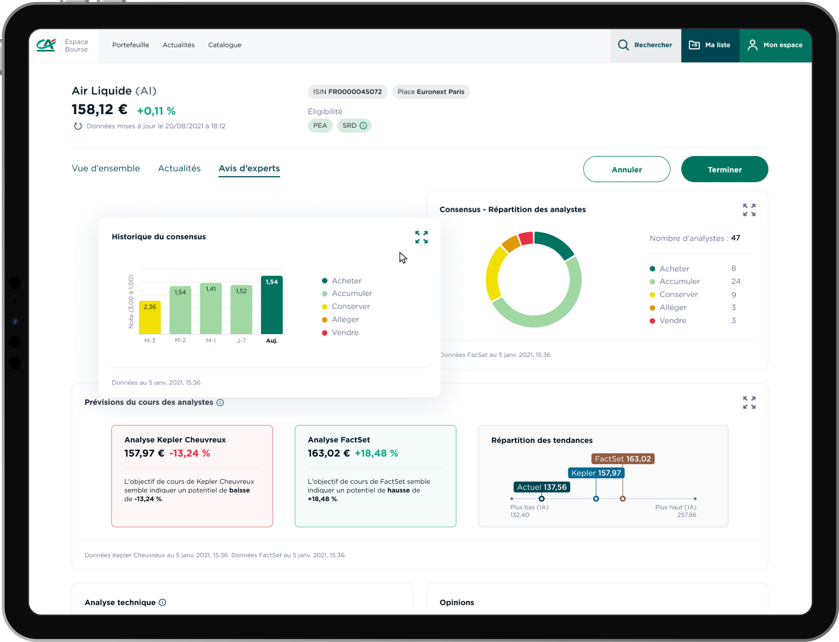
We asked people what are they looking for when they go to the app. The main pages were an overviewof the wallet(s), the product page where they can found news, advices from experts, the stock price, and all the workflow pages to buy or sell stocks.

Key data
20
%
Are experts
80
%
Are novice
60
%
Have 1 or 2 products lines
02
Benchmark

What is the competition doing?

Focus on the news

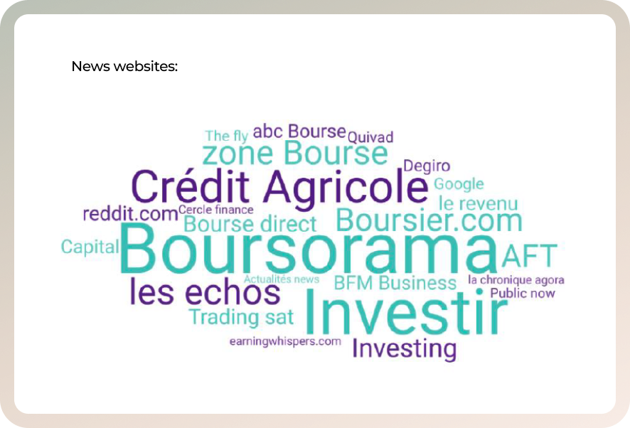
We asked people where did they go to found news about stock market: online, on newspaper, on TV, on radio, on social networks, etc. We did a benchmark based on what they answered.

A lot of data table

We wanted to address novice as much as experts. So we looked at data visualizations to display stocks by sectors for example: how to identify which market is going up and which one is going down in one look.

03
Interfaces

A fresh look

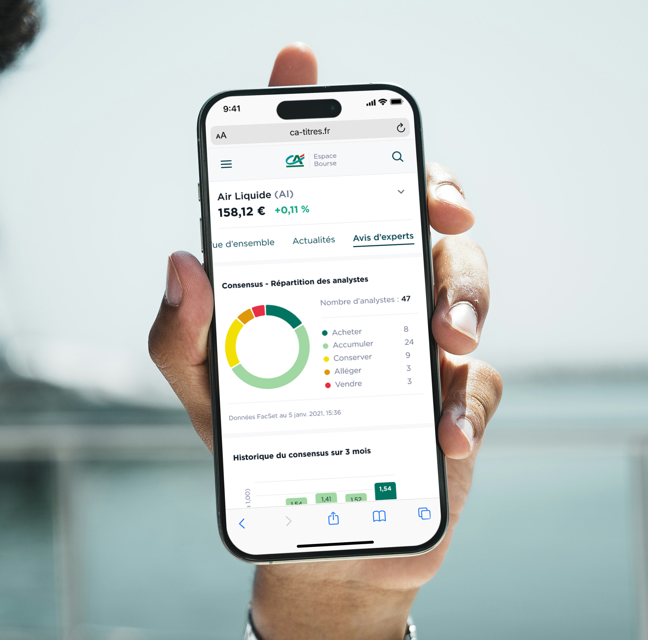
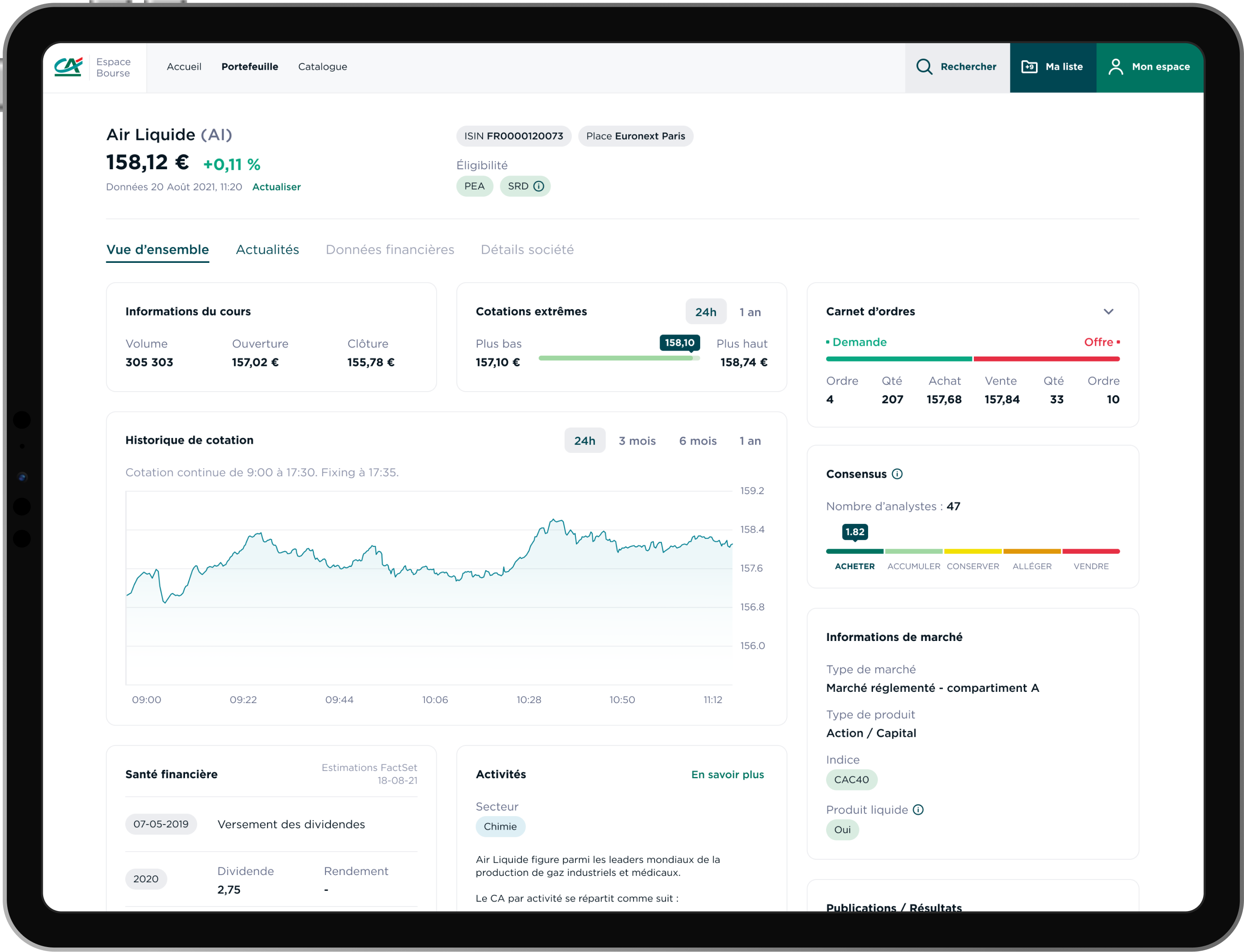
Interface: Financial Product Overview
Financial Product Overview
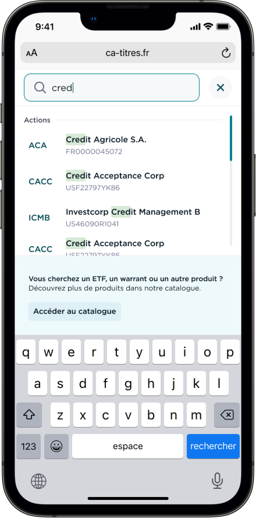
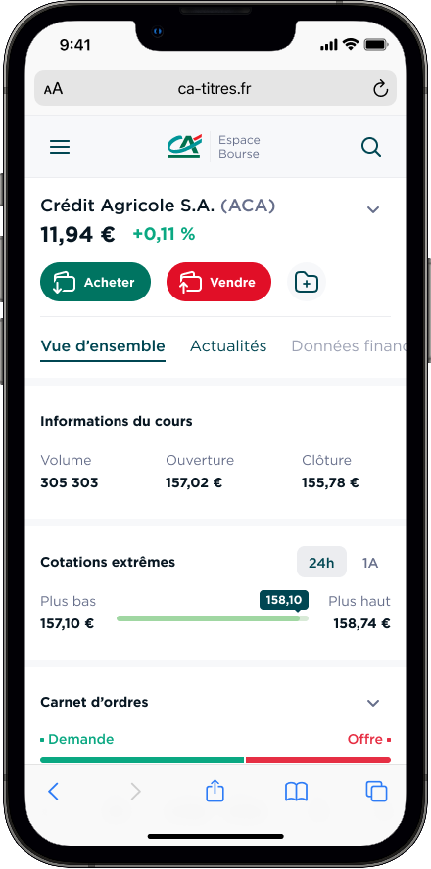
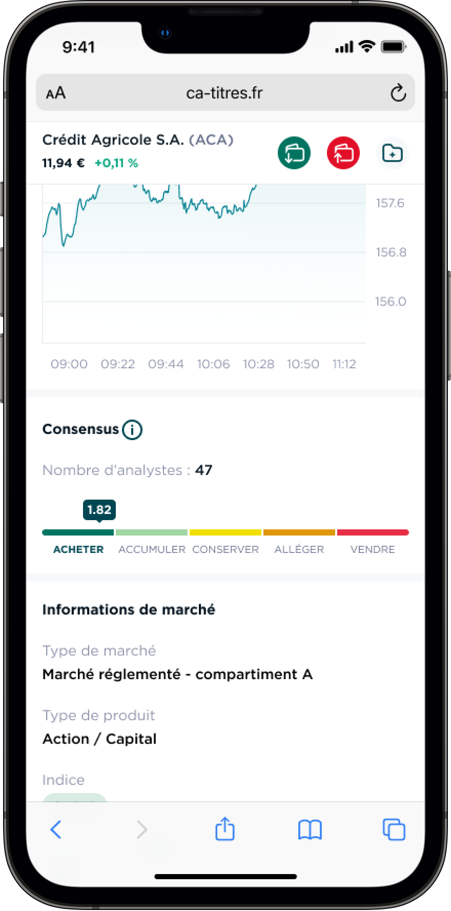
Mobile app search barMobile app product pageMobile app product data
Searching for a financial product on mobile

Data visualization

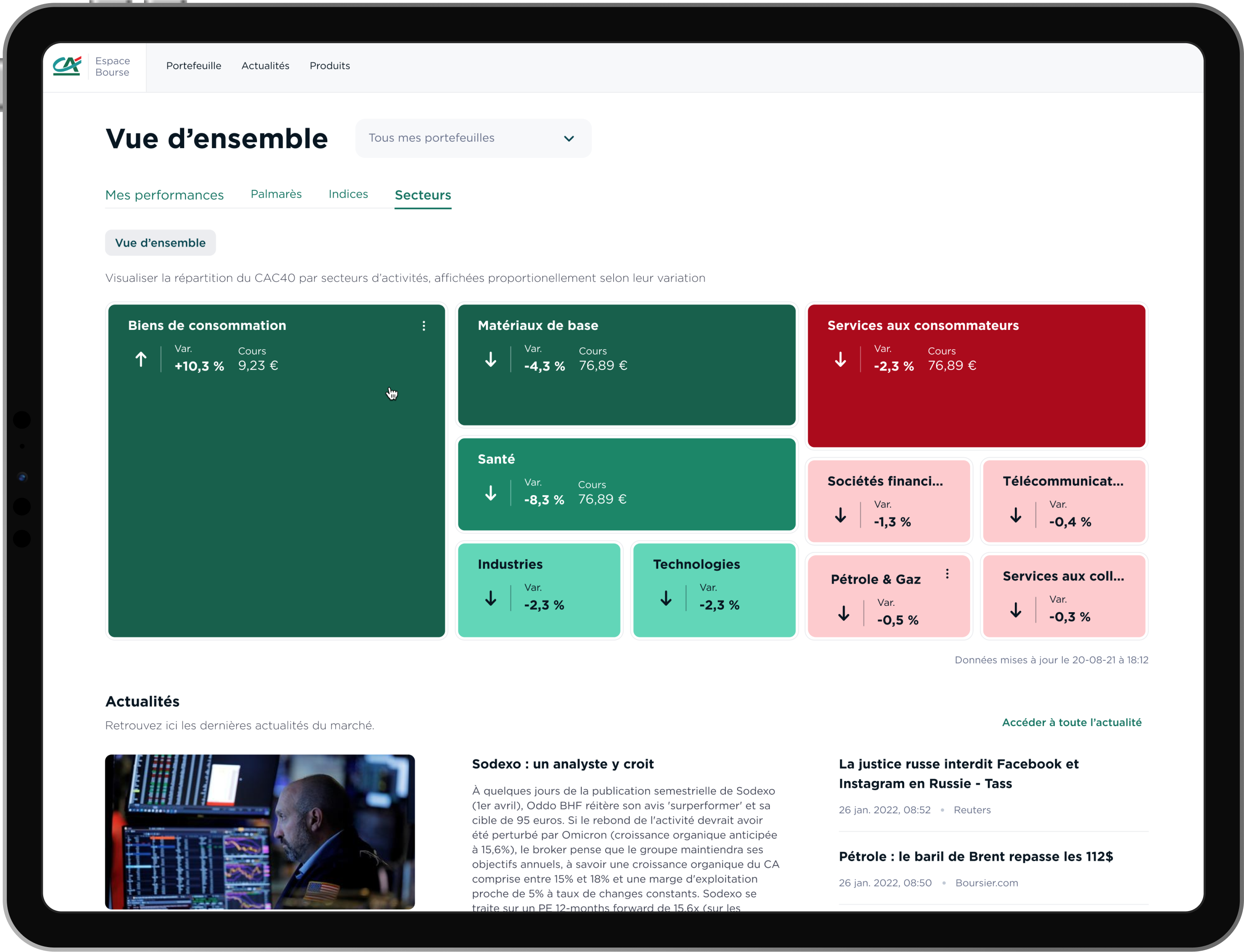
Here is an overview of what we did on the sectors news page. Big block means there is a big variation in the sector.

Since we wanted to address everyone, we followed accessibility criteria. For example the information displayed are either black or white to have enough contrast with the background.

Interface: Sectors overview

Contextualized information

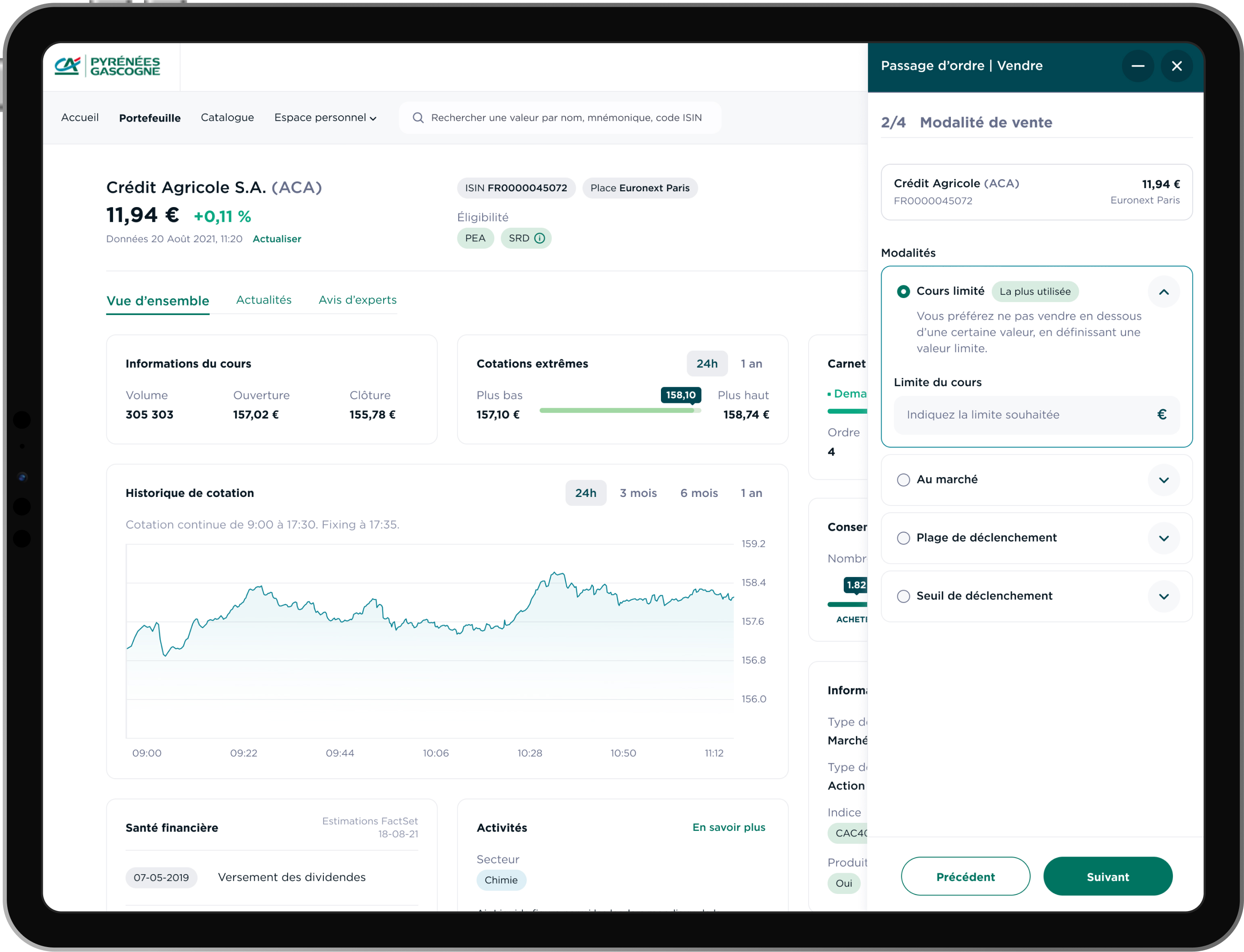
When users need to understand specific vocabulary from the finance world, we added text to help to understand. We also put the terms "the most used" when they do not know which choice is the most common.

Interface: selling

Customization

Some functionalities were identified only for novices or only for experts. For example, novices need help to place an order, but expert want to do it fast in one step. Both novices and experts can customize some elements in their settings according to their preferences and level.

Interface: customization
04
Design system

Same interface. Different clients.

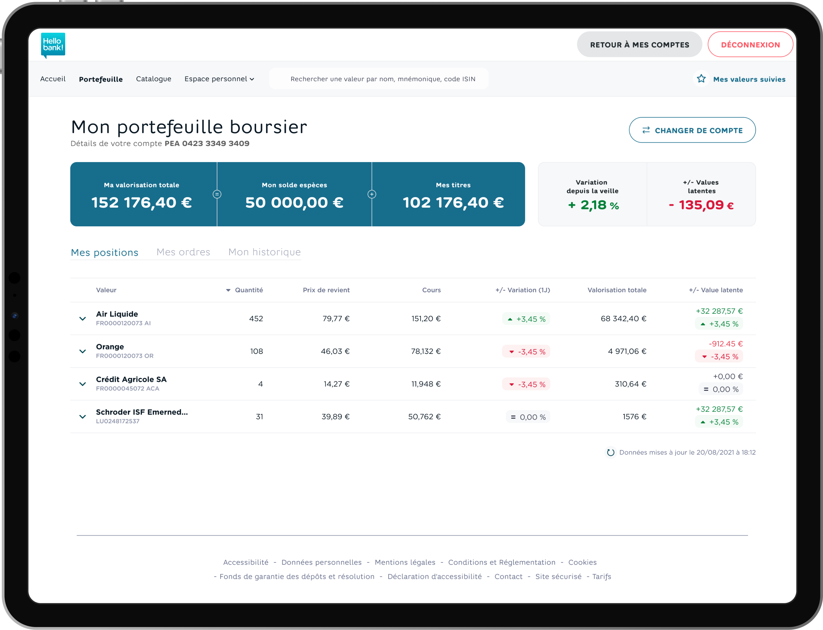
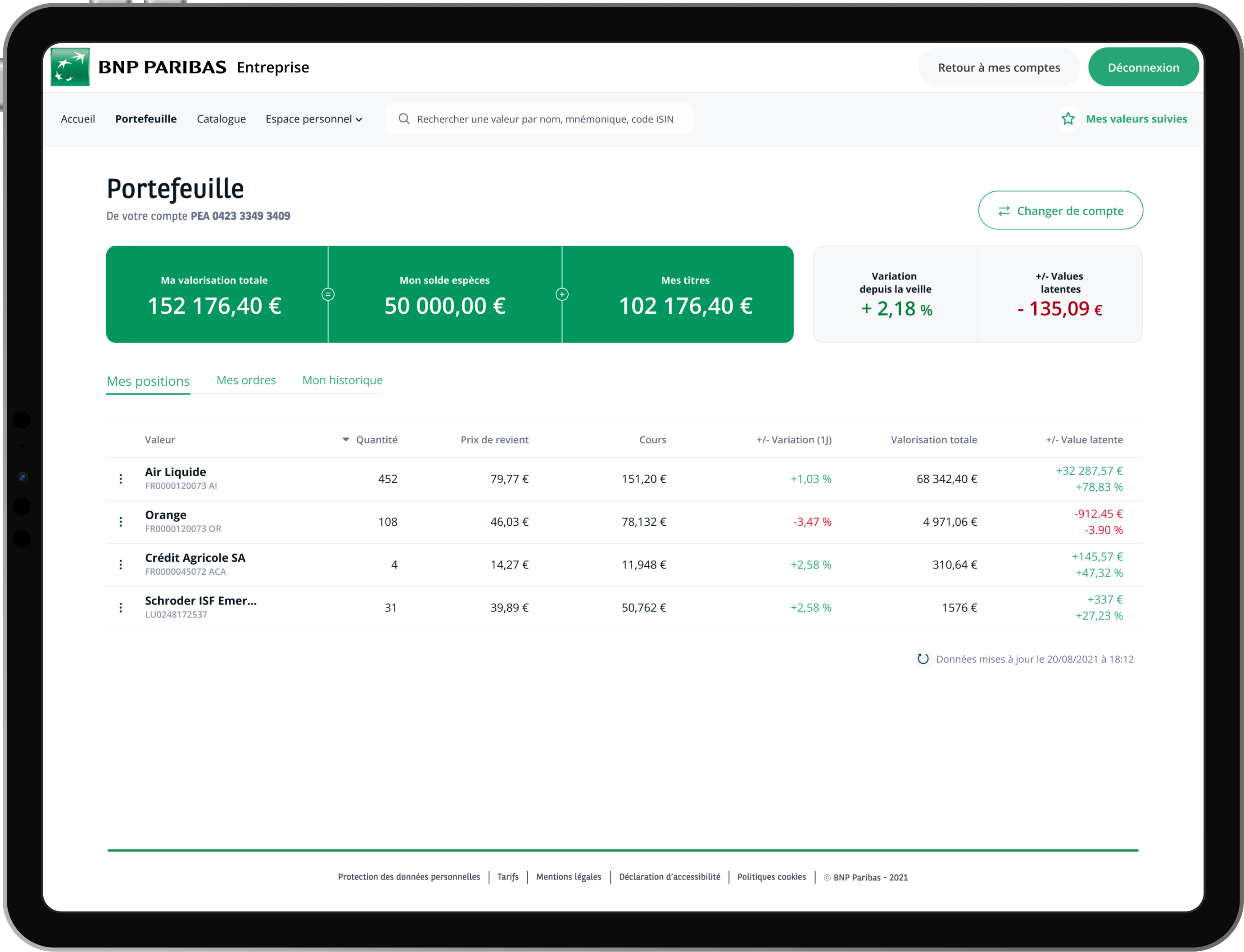
We were working for different banks such as Crédit Agricole, BNP Paribas or Hello Bank, so we developed a design system with a white label design to be able to switch font, color, etc. according to the bank.

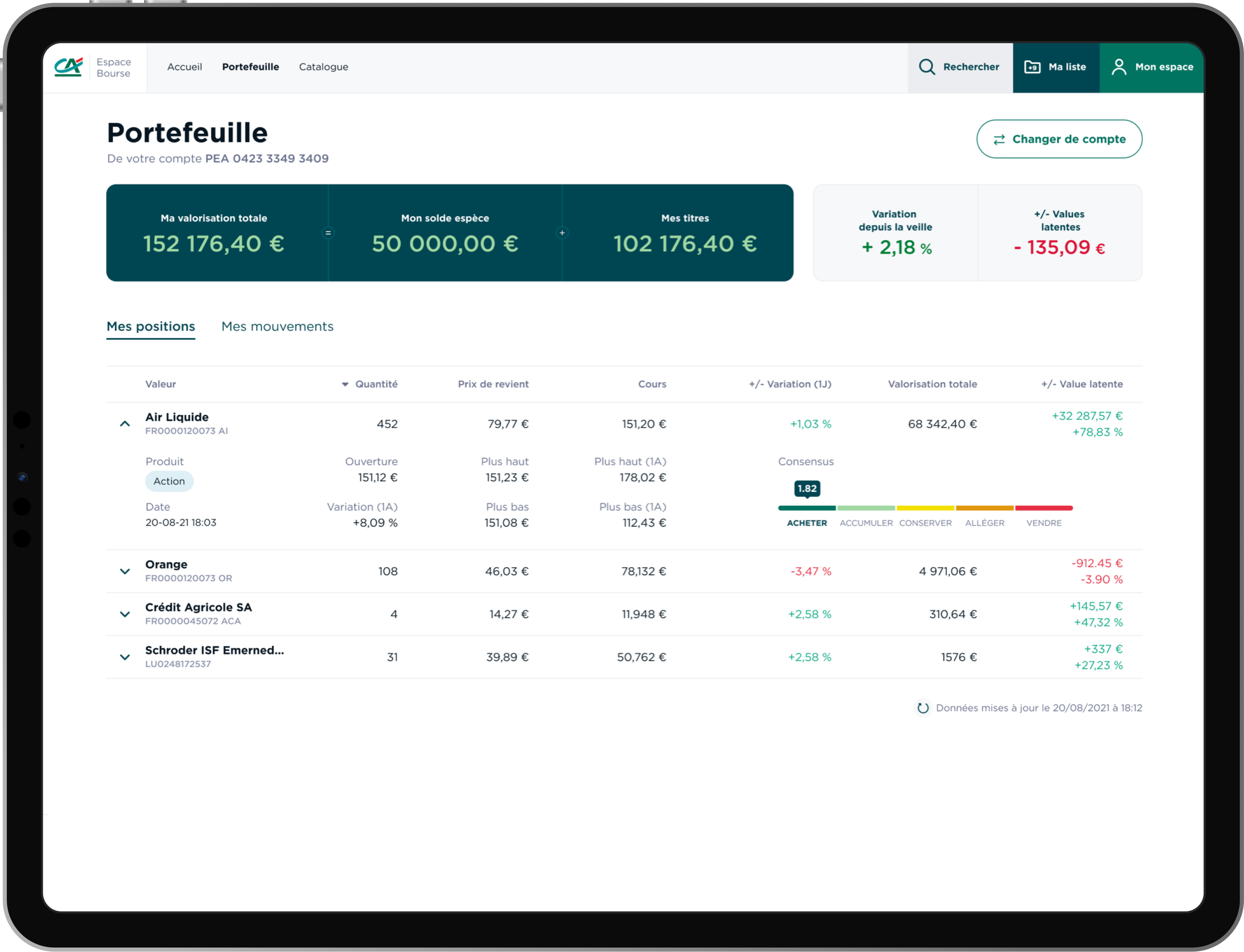
Financial products in the portfolio for Crédit Agricole
Design for Hello Bank!
Design for BNP Paribas
Design for BNP Paribas
05
User tests

What did the users think?

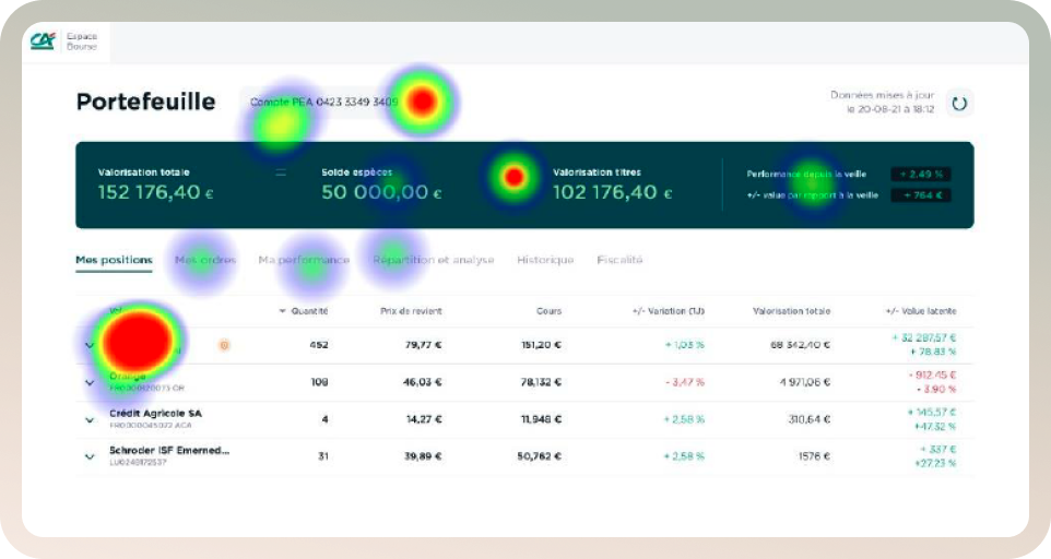
Wallet heat map

Heat map

We did some user tests with Maze, a website which can show a heat map for every screen. Every mouse move, click, or keystroke determined the heat map of a web page.

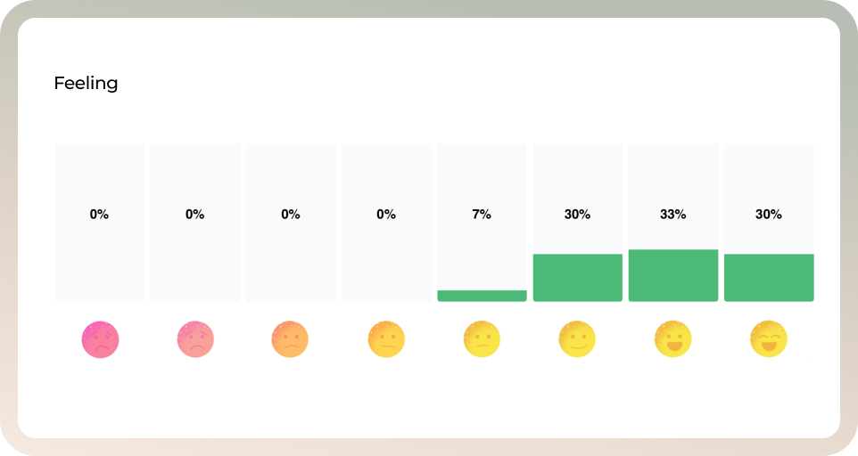
Once the website was ready, we used 300 beta testers to get feedback for the future release.

People mostly satisfied

According to the test, people liked: "the user-friendliness and simplicity", "the clarity of the pages". Some people were "looking forward to this new update".

Among what they would like, they said "an additional dark version would be a real plus", "have stock prices in real time like other websites".

To
sum-up
Back
See all projects
Next project
Crédit Agricole / Agilauto -
Leasing car website